Photos: Tea;rapy Original BrandingTea+rapy
This project involves the rebranding of Tearapy, a Korean tea company that ingeniously merges the words "tea" and "therapy."
My journey began by crafting a logo that harmonizes both my personal tea experiences and the essence of the brand. Growing up in an Asian household, herbal tea often stood in for medication during times of illness, leaving an indelible impression. As someone who personally prefers tea to any other beverage, I aimed to encourage young adults, often reliant on coffee, to embrace tea as a wholesome alternative.
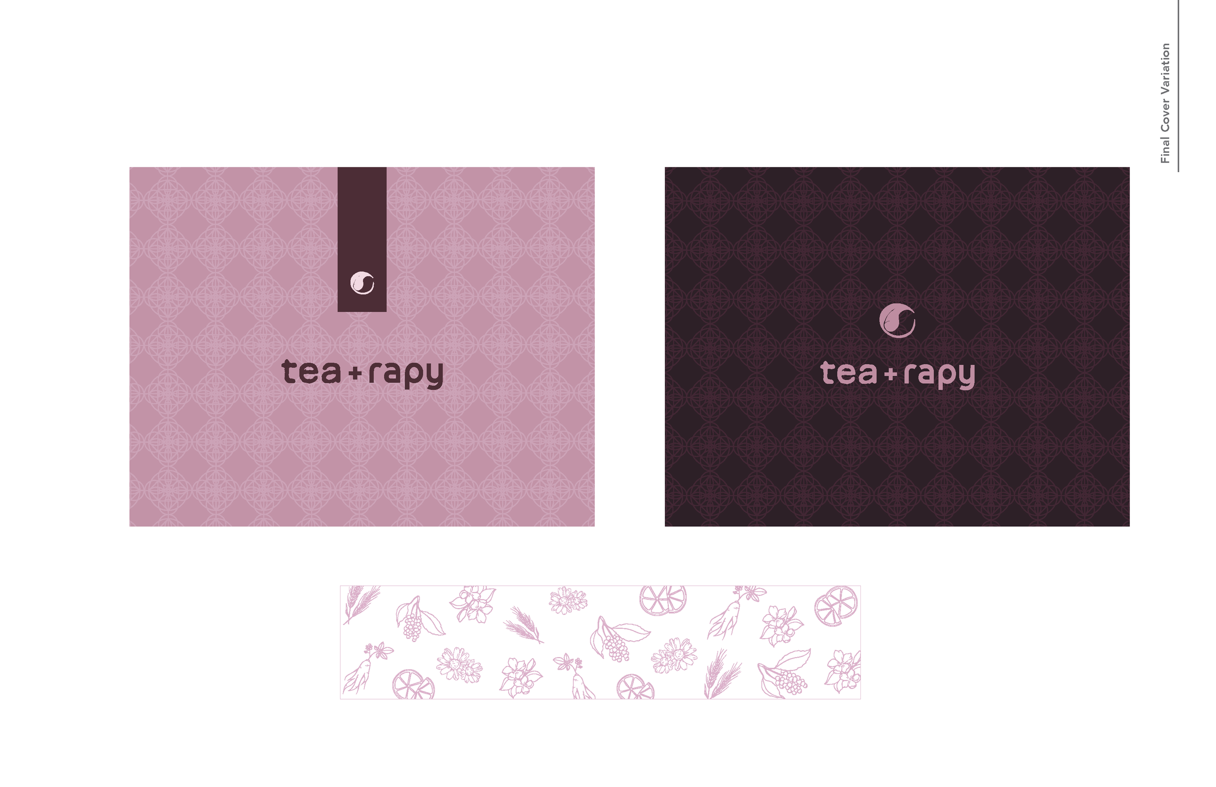
The revamped logo seamlessly fuses the dual symbolism of South Korea's flag, my place of origin, and the yin-yang philosophy, signifying the brand's commitment to harmonizing holistic well-being.
My vision extended to modernizing the stationery system and packaging design, purposefully captivating a younger demographic while subtly honoring Asian heritage. Inspired by Hanbok, Korea's traditional attire, the packaging design boasts intricate patterns, and the choice of cylindrical containers reflects the cylindrical tubes used in Asian acupuncture herbal medicines, offering a nod to tradition with a contemporary edge.